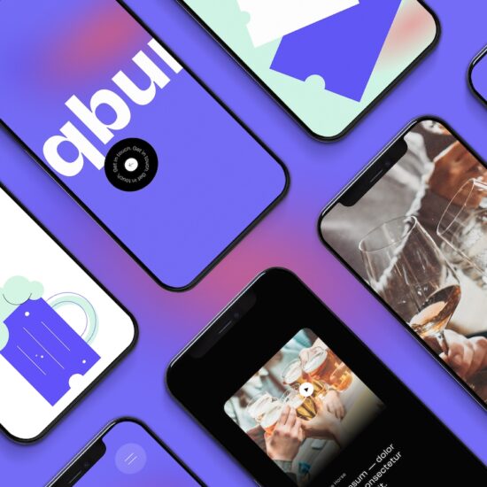
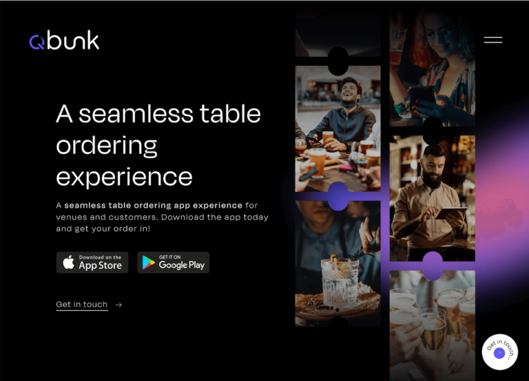
Starting with branding and positioning, we developed a strategic 6 month relaunch plan that would reintroduce Qbunk to the market and create the strong foundations needed to scale. The final brand reflects the clean, sleek tech that Qbunk has created. We incorporated both a loading symbol and power button in a strong colour that could be used to expand the brand’s visual style.
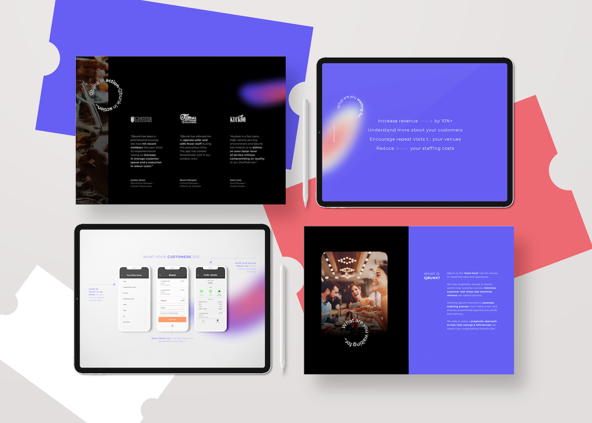
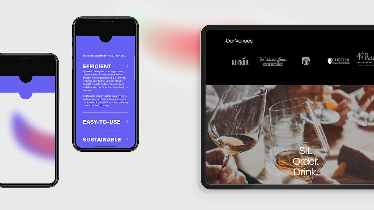
When approaching the website and digital presence, it was important for us to showcase the innovative tech that Qbunk created, in line with a fun and emotive hospitality feeling. We worked to develop a sitemap and user journey that would suit a ‘time-poor’ venue manager, who would likely be interacting via mobile in the first instance.
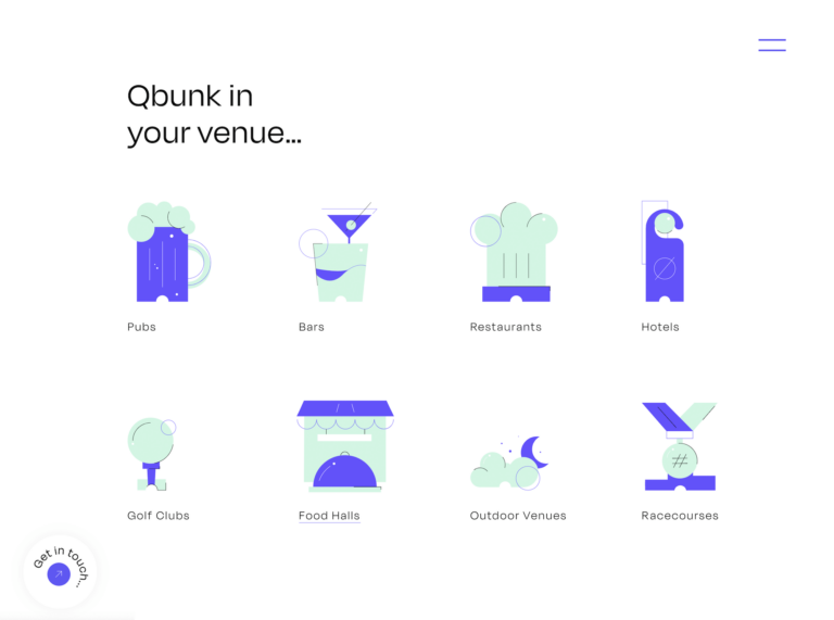
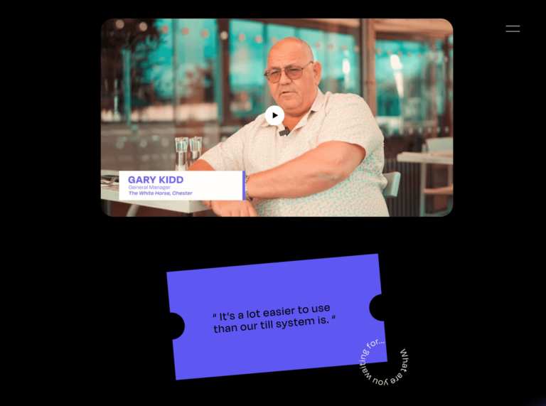
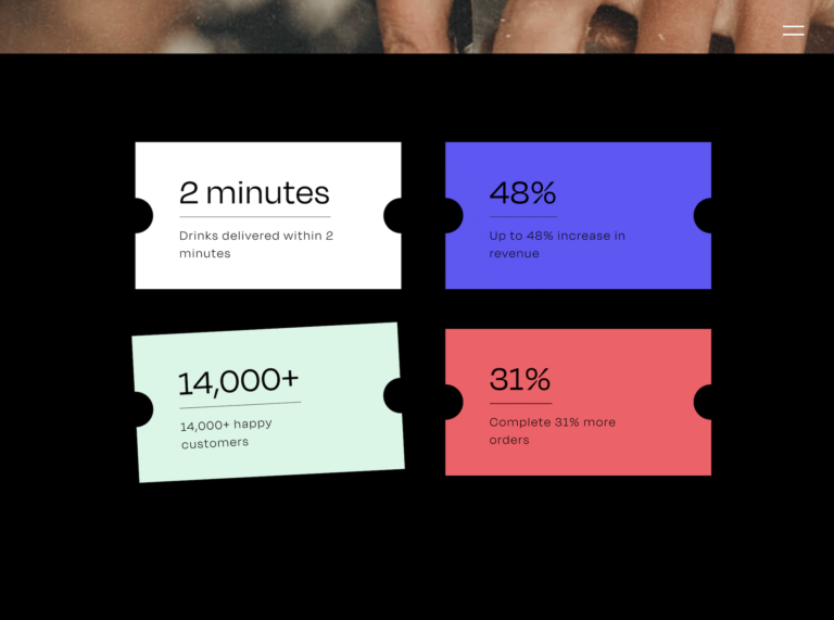
We focused on engagement points that would encourage a venue owner/manager to book a site audit, and highlighted various statistics that would drive conversion, such as increased revenue, decreased waste and improved staff and customer experience.
240%
Increase in web traffic in first 3 monthsThe relaunch of the website saw impressive statistics with a 240% increase in the first 3 months of live (compared to previous period).
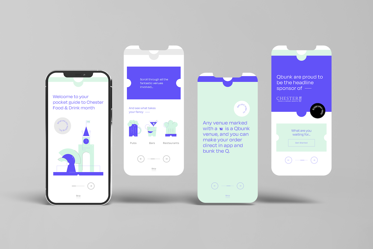
This was generated through a targeted social media campaign to venues and hotels in the North of England, which was kicked off with a strategic ‘Lead Sponsor’ partnership with the Chester Food & Drink Festival, held at one of Qbunk’s largest clients – Chester Racecourse.