

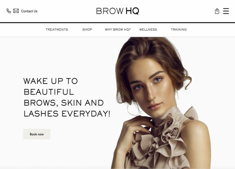
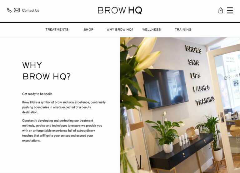
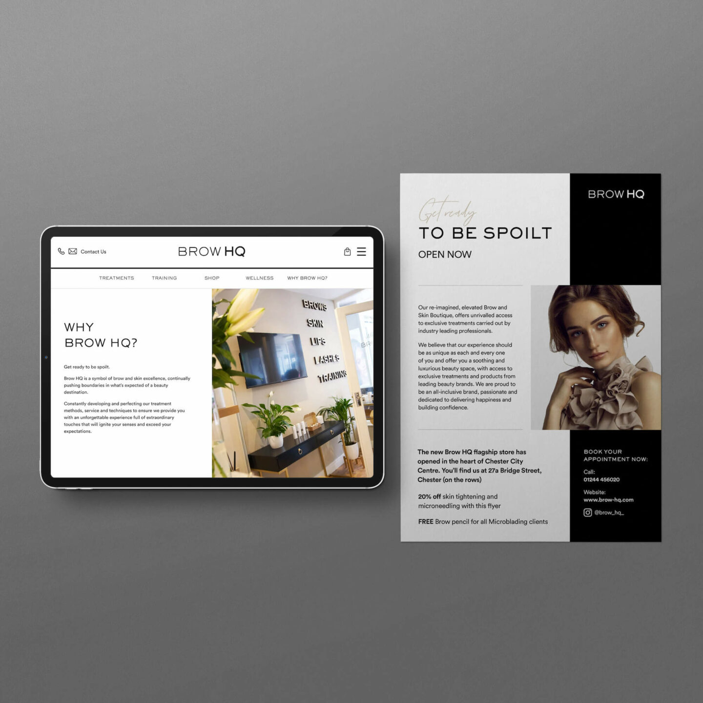
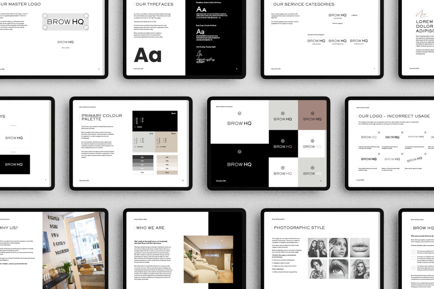
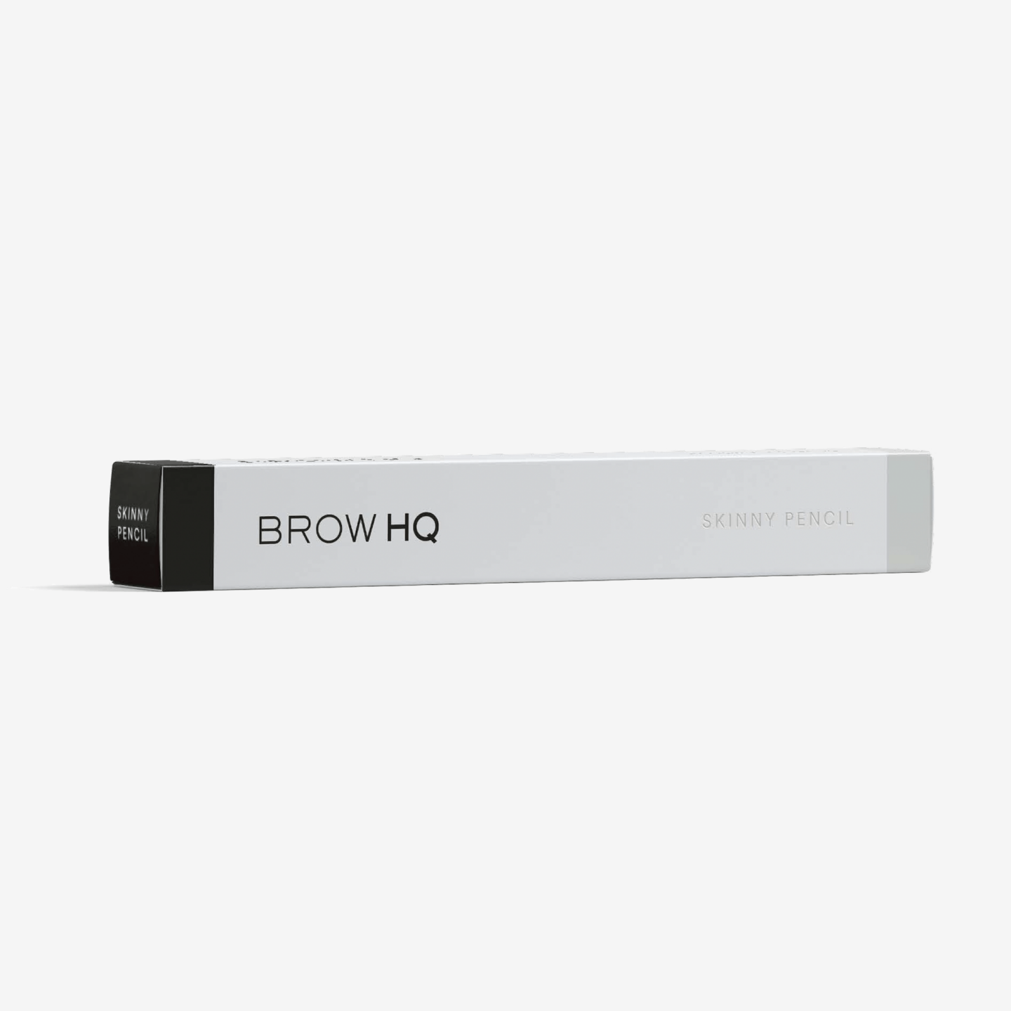
The project began with a brand update, moving to a powerful monochrome palette and updated fonts that aligned with founder Leisa’s vision for the new boutique. Graphic Design included showcasing their treatments and creating impactful in-store and external graphics, sales materials, and product packaging designs.
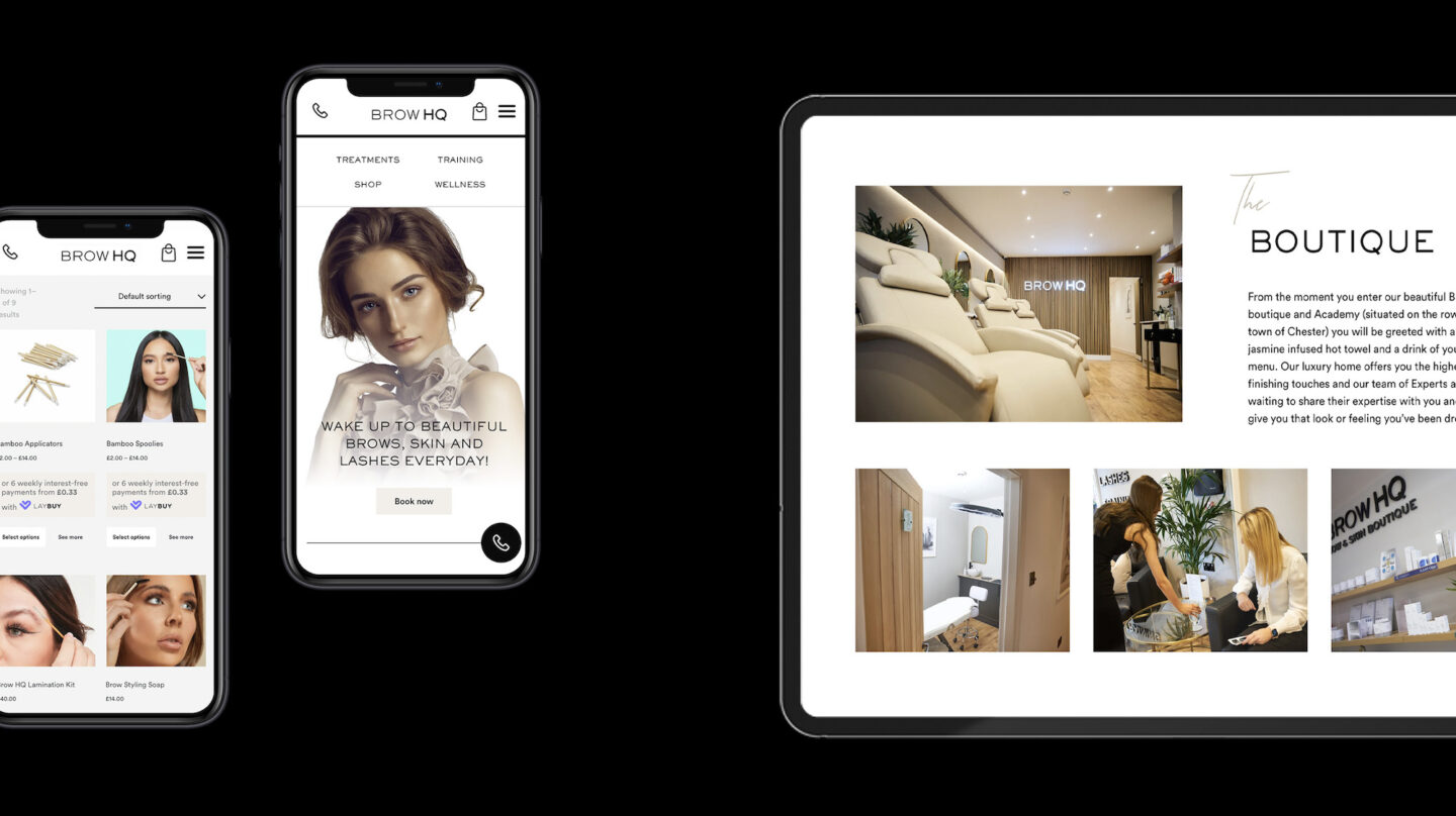
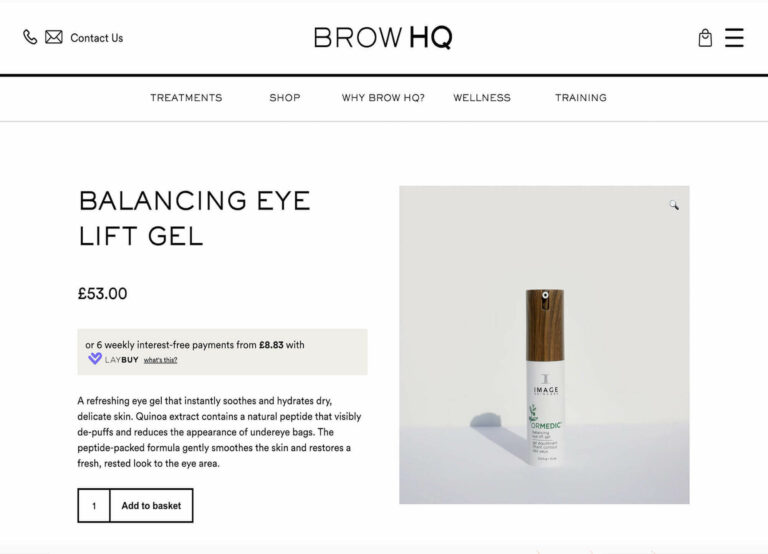
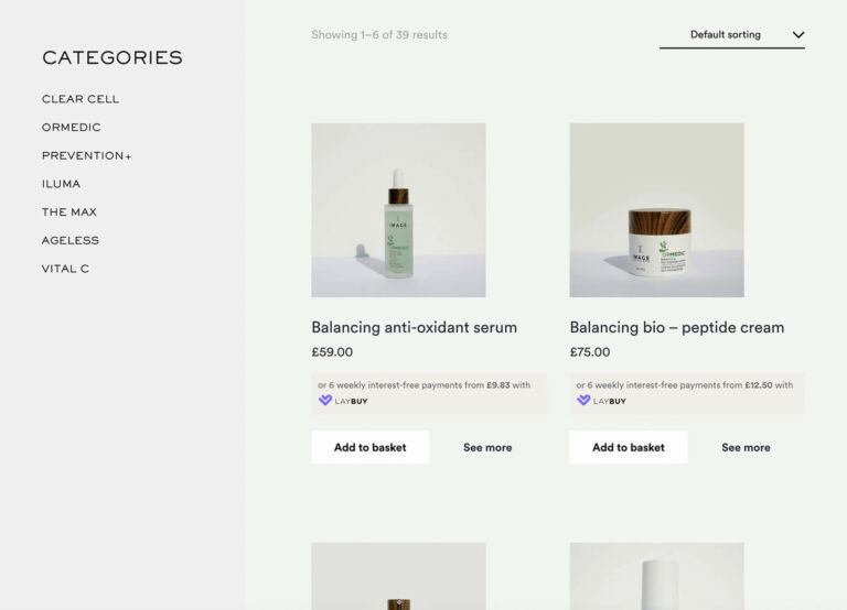
As the central resource for viewing and booking their extensive range of treatments and training courses, the new Brow HQ website was a critical investment for the business. It needed to help visitors understand the exceptional experience and unique offering. Having three clear user experiences- one for beauty treatments, one for training courses and one for an online store (e-commerce) meant that careful consideration needed to be given to how users would navigate through each.
This incredible salon and training centre is now open and their own range of products, plus some carefully selected complimentary brands are available to purchase in their online shop.
We have been so pleased with the work that made of möre has carried out for us. They have taken us through a complete rebrand and we are absolutely delighted with the new look and feel that now sets us apart from our competitors whilst carving out our own space. The team has been so dedicated and has not only delivered on time and with such professionalism but has also supported me with the brand rollout and photoshoots to ensure complete consistency in-house and across all our channels. We highly recommend them.
Leisa Roberts, BrowHQ Founder
